Print is not dead. There’s something comforting about holding a printed piece in your hand, it has weight and texture and a gravitas that a web piece doesn’t always have. Someone took the time and expense to print something nice, so it gets your attention. It’s almost come full circle as not long ago, a printed marketing piece was felt to be old fashioned and out of step with a digital age. Now, a website is to be expected, although it’s always a pleasant surprise when it’s a really good website, and a high quality printed piece is a sign that you are professional, you cover your bases, dot your i’s and cross your t’s. Just as long as you don’t string together a bunch of clichés.
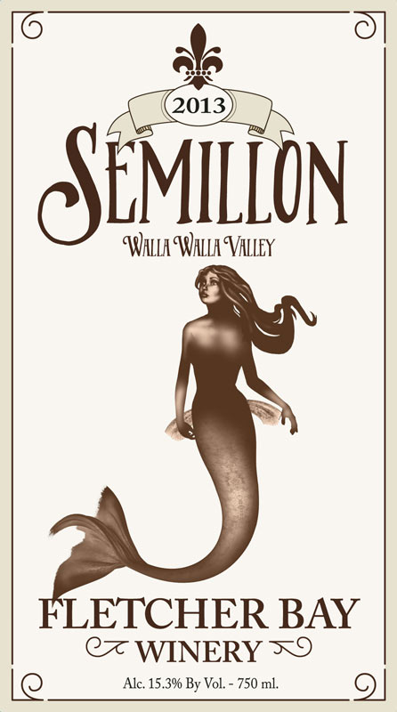
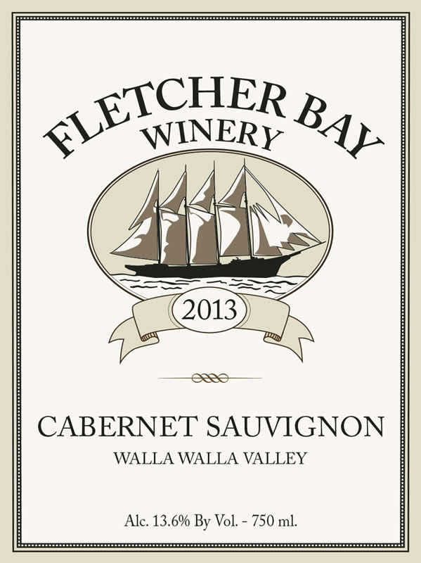
We live and breathe digital at Wilford Design, websites and applications are a huge part of what we do. But we also design nice printed pieces. The classic concepts of good design apply to both print and digital, from an admin user interface to a wine label, it’s all about typography, hierarchy of elements, space, color, the grid. One more advantage to working with Wilford Design is that “Design” is in the name, it’s in our blood, it’s baked into the cake, it’s… hold on, there I go with the cliches again. Anyway, we approach all our projects from a design perspective, to impact your target audience on an emotional level.
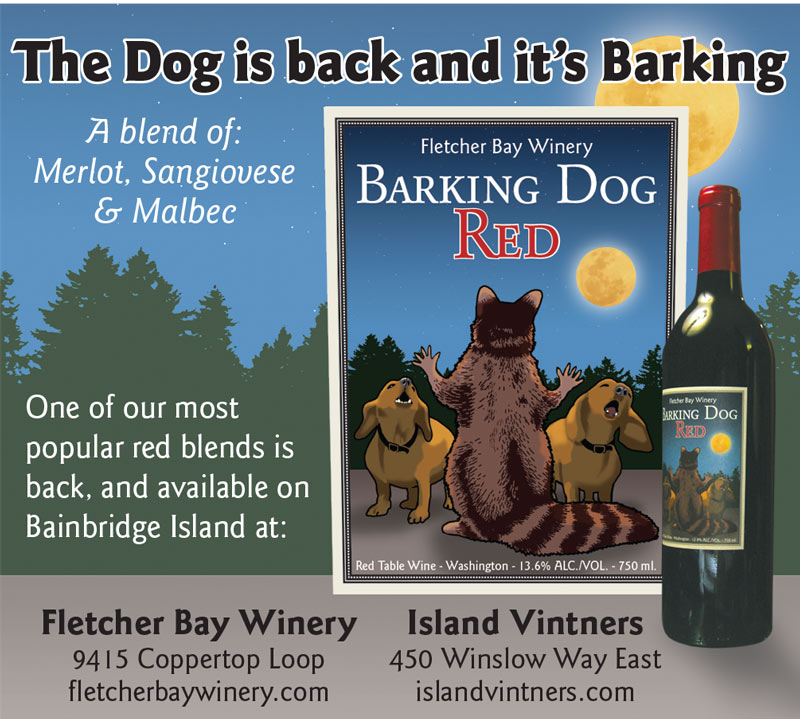
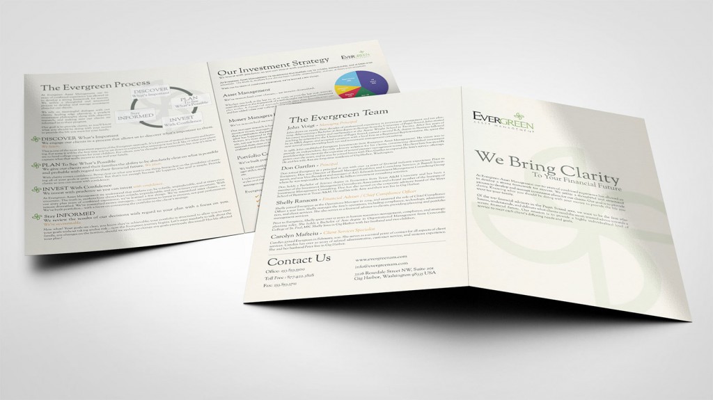
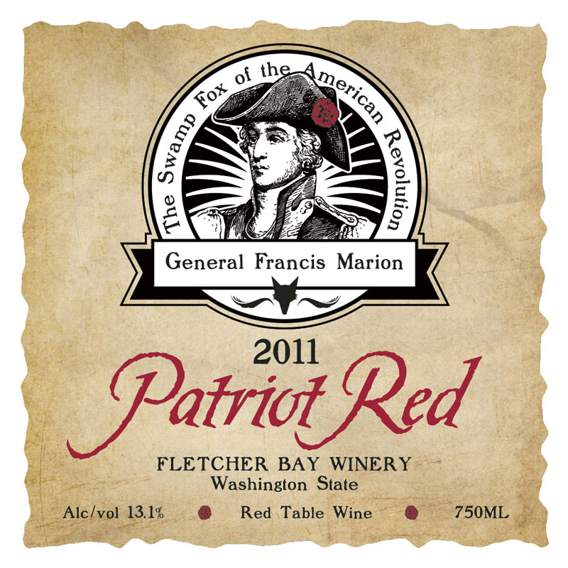
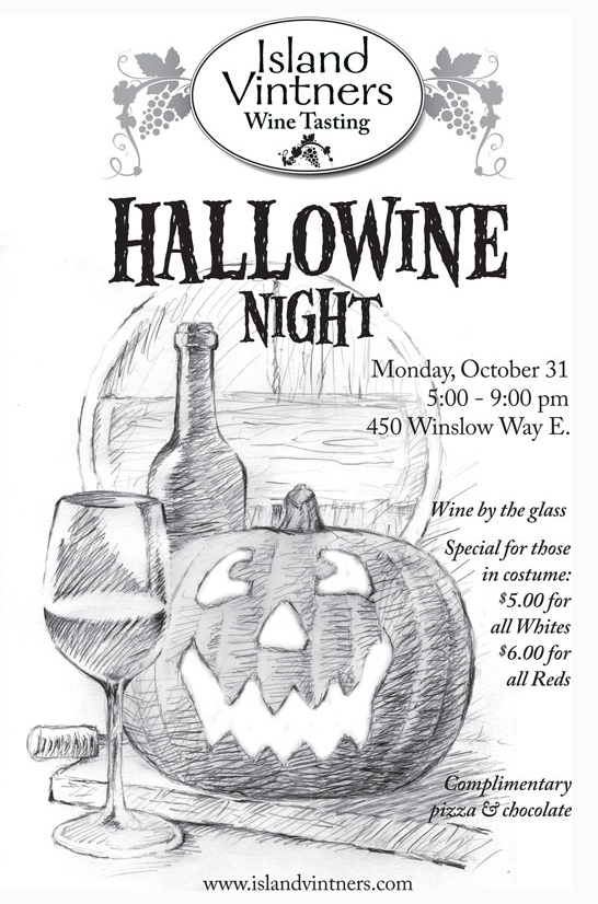
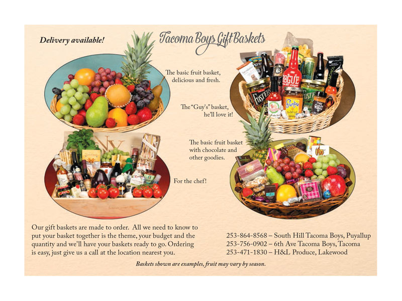
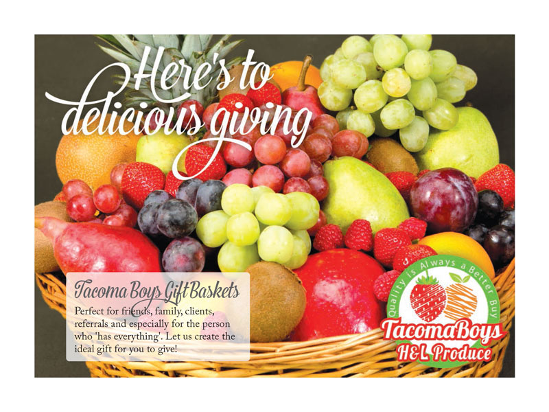
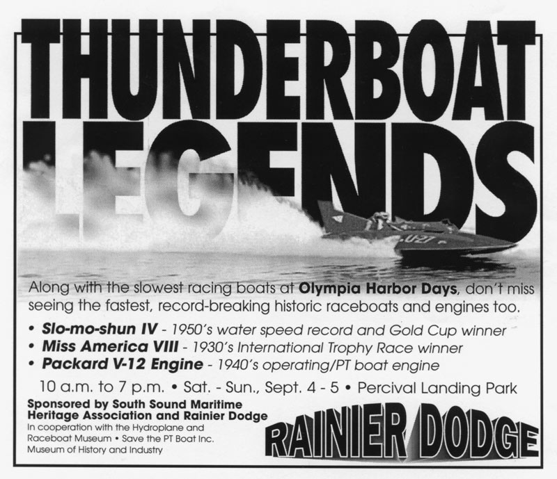
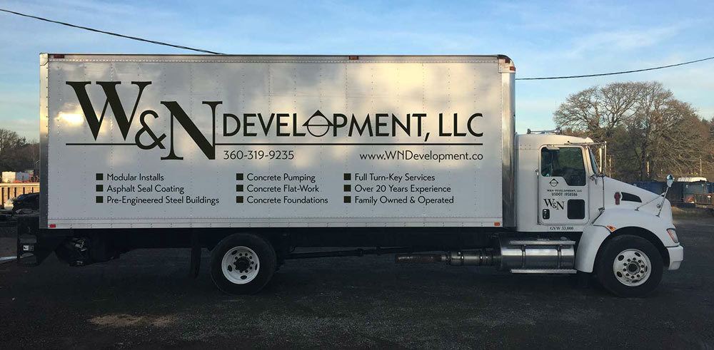
Some of the projects we’ve designed: ads, brochures, rack cards, post cards, business cards, wine labels, large banners, signage.

